Tuesday, November 6, 2012
Find Us At Our New Home!
The Book Art Blog has moved to a new home! Check us out at TheBookArtBlog.com!

Wednesday, September 5, 2012
San Francisco Center for the Book Presents: Roadworks 2012

Wednesday, June 27, 2012
1,000 Individually Unique Letterpress Business Cards
To coincide with the launch of my new website, I decided a fresh batch of business cards were in order. I decided that rather than going for uniformity, as most business cards do, I would make every single card a unique work. 24 type faces, 14 types of paper, over 13 different shades of ink, all with alternating backgrounds / layouts = each one is unique!


Sunday, June 3, 2012
Letterpress Design vs. Photoshop Layouts: Gutenberg Era Technology Vs. Your Epson

[Vandercook Vs. Laserjet: Separated by 500 years and a whole lot else.]
How to design in the 21st century using technology from the 15th Century
Inspired by a post from Cranky Pressman, I thought it might be useful to write on the subject of letterpress design vs digital design. Letterpress can be a deceptively intimidating medium for artists who are more attuned to designing graphic works in Photoshop than using physical elements such as lead type, ornaments, wood or metal furniture, quoins or keys, and Gutenberg-era machinery which can (and does) require maintenance and repair and still inevitably results in some inconsistencies (which is, of course, part of the charm). It's been my experience that a great many graphic designers simply ignore these differences and treat the letterpress as if it is just a different kind of digital printer. This means losing out on some of the perks of letterpress which can result in more dynamic, complex, and artistically interesting designs. In this post, we'll examine some of the differences in the tools themselves in order to investigate how this can and should impact our choices in design.
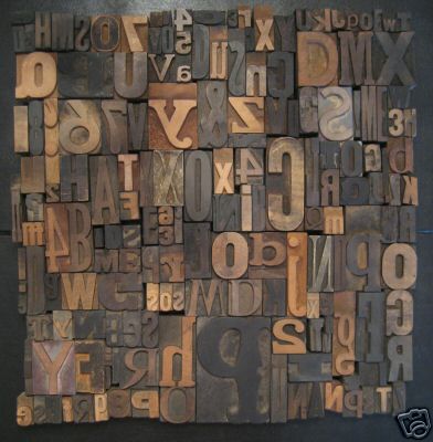
[An assortment of wood type such as this may have no true equivalent in digital fonts.]
The Type
Using lead type in lieu of graphic fonts presents certain parameters which the artist should consider before beginning their project. Graphic fonts, unlike cast type forms, come with an unlimited supply of letter forms (in my experience particularly the letters "i" and "e") which may not be available in whatever supply you happen to be using (in other words: it is entirely possible that if you are printing large blocks of text using letterpress you will run out of letters and either have to do another run or mix type which is something you should really really not do unless you have a damn good reason). Additionally, fonts are limited to what's available in the studio, as opposed to what you can download from the internet in a couple seconds (and often for free). This has its pros and cons as well. Several digital fonts, such as Garamond, are not at all like their lead type originators (although Garamond might be a poor example as it was developed at different times by different designers / punchers and is therefor complicated). This means that there are type faces that you'll find more appealing in digital format than in lead type and vice versa. There are also many type faces unavailable in one, but available in the other. So the first step is: know what type faces you have to work with and what supply (in your specific size!) is available. Plan accordingly.

[From True to Life by Julie Chen of Flying Fish Press. Created using a combination of letterpress, pressure printing, and polymer plates.]
Ornaments, Polymer Plates, Linoleum Blocks, Etchings, Engravings, and other Illustrative Options
Unlike digital design where you can add photos, scans, shapes, and other imaging techniques at whim, letterpress relies on what is physically available. This means: you either find something made for the letterpress, adapt something to work with the letterpress that won't damage the equipment (i.e. is type high and not poky, not corrosive, or otherwise threatening), have someone make it for you, or make it yourself.
- Find Things: it's still possible to find ornaments, type, and all sorts of letterpress materials on the web and in type foundries. (If you don't believe me, try here, here, here, and here.) Just make sure everything is type high so you don't have to adapt it and understand that type is measured in picas not points (get a pica ruler if you have no idea what this means).
- Adapt Things: It is possible to adapt materials you find in "the real world" to use as materials for image impressions in letterpress. Just make sure (again) that everything is relatively flat (or at least not pokey) and type high (23.3 millimeters or 0.9186 inch). Some options for this: with fabrics you may try making something like a sandragraph or a pressure print (my basic recipe which I will elaborate more on later: take a linoleum block, place it on the bed, then design something on a piece of paper using artist's tape, cut out shapes, etc. ink block, secure paper with design on it to the cylinder and print!). Keep in mind that this will only pick up the texture of the fabric or outline of the design, and not the color / design of the fabric.
- Have Someone Make Things: It's still possible to find places who will make you polymer plates of your designs or even artists who will create linoleum blocks or etchings for you. Some examples here, and here.
- Make Things: Believe it or not, this is probably the easiest option. You can use the methods listed in point one (pressure print / sandragraph) or can: carve a linoleum block, make your own polymer plate with a polymer plate maker, or make your own wood engraving. You can also leave spaces so as to add "elements of the hand" like illuminated lettering, stencils, stamps, gouache, watercolor, etc. later on.
 [A complicated letterpress lockup using a good deal of metal furniture.]
Lock Up Vs. Layout
In Photoshop, you need only lay out the elements in the position you wish in order to have them print exactly as you want them to (with some exception to the differences in how the software and the printer interpret color and dimensions). With letterpress printing, you must use furniture (made of wood or metal) to "space" your objects. This is very similar to how spacer objects were used in early web design and is not so different from how web designers use absolute positioning to place an object a certain measure from top /bottom or left / right. To determine where an object must lay, you should measure with your pica ruler. Then, place a sufficient amount of furniture around that object so it will print in the right place. You must also register the paper so that it "lands" where you expect it to. For more on how to do a lock up on the press bed, go here. You'll notice that you're limited to whatever size furniture is available (which will take some math and some getting used to) and that you'll also need to "lace" the furniture so that there are no large gaps. Something also worth considering: wood furniture tends to have more "squish" than metal furniture and overall changing the tightness of the quoin can result in the shifting of text / images! Something to keep in mind.

[A print by Jessica Hicshe. Each color / overlapping shape & text is a new run!]
Print Runs Vs. Layers
In Photoshop, you'll create layers in order to get different colors layered fonts & shapes on to the same page. Using letterpress, every alternate color (unless you're doing a carefully choreographed rainbow roll) as well as anything that overlaps, will require its own run (that means: cleaning / inking the press and making sure the content & the material it is to be printed on are both registered properly). This may explain why a good deal of novice letterpress printers only have a few "layers" of color / overlapping text.

[A blind stamp of the word "thanks" is created through a lack of ink, giving the impression that one wishes to thank the person but in a subtle, non-intrusive way. Image from Penelope Press.]
Impression
Without a doubt, the most distinctive and possibly best-loved characteristic of letterpress printing distinguishing it from digital or offset printing is the impression that is left when the paper is pressed against whatever is on the bed. This impression is also called the "bite" (a heavy impression) or "kiss" (a light impression). With letterpress, it's possible to leave an impression on the paper without using any ink at all. This is called a "dry stamp" and can be a very effective device when conceptually suitable to the layout of the content. Impression is something that can be changed by raising or lowering the bed (use extreme caution while doing this so as to not damage the equipment!) This is also one key difference you should keep in mind when selecting paper. Thicker paper such as Rives or Arches may result in a different impression than thinner papers. When in doubt, try experimenting with some samples!
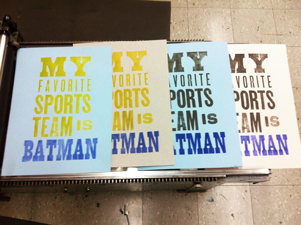
[Differences in ink variations on a print by Naomie Ross.]
Consistency & Color
A phenomena that occurs in every kind of printing, but is far more noticeable in letterpress is consistency. Ink fades, particularly fast in larger letter forms and wood type which require more ink. Either plan to have some inconsistencies in your design in terms of the concentration of ink (which will impact the color), or be aware of how much ink you want for X effect, and monitor ink levels (and re-ink) accordingly. Also keep in mind that it's a bit more difficult to mix a particular shade of ink for the letterpress than it is to pull up a perfect RGB or Hex indexed color (or even steal one from ColourLovers). While a pantone guide with a points index can help guide you, I've found it's better to be open to change / experimentation and have some lee-way on your color decisions. And do keep in mind that the color you've mixed will look different depending on how much ink you're adding to the cylinder (tip: it's easier to add than to subtract!)
Thursday, May 17, 2012
Seager Gray Gallery - The Art of the Book 2012
For those who are local to the Bay Area, this is just a friendly reminder that you only have one week left to check out the 2012 The Art of the Book exhibit at Seager Gray Gallery's new location in Mill Valley! The exhibition includes works by Daniel Essig, Julie Chen, Kota Ezawa, Stephen Paul Day, Ted Muehling, Richard Shaw, and more. An excellent mix of sculptures, fine bindings, and artist's books by a curator who is truly dedicated to the art of the book. Check it out!


Wednesday, May 16, 2012
Combat Paper Project
This semester, I was very lucky to be able to take part in a paper making workshop run by the director of the Combat Paper Project Drew Cameron. Combat Paper is a uniquely poetic and intensely inspiring project. The project was started by Drew himself about ten years ago. An Iraq war veteran, Drew emerged from the war seeking some means of voicing and reconciling his experiences. He found his outlet for expression in an unlikely place: a community college paper making class where he made the decision to cut up his Army uniform (or as he puts it "liberate the rag") and make the fiber into paper.

[Drew Cameron Director of The Combat Paper Project talking to Mills College students at the workshop]
Drew, an energetic and charismatic teacher, not only shared with us the history of paper making (short version: founded in China around 100 AD due to paper fibers washing up on the shore and creating sheets, transferred to Europe during the crusades, hasn't changed a whole lot since then with exception to the invention of industrialized machines such as the Hollander Beater which have sped up and perfected the process. I promise to give the long version in a later post on paper making!) but he also shared with us his own history. It was exciting to hear someone speak so passionately about a process that so many people neglect to consider regardless of what a large impact paper continues to have on our lives. Equally inspiring was how Drew managed to grow and support a project where not only he could share his own experiences in a completely new and unexpected way, but where he could encourage others to share their stories through similar processes.
 [Combat paper makers "liberating the rag"]
Combat Paper today has locations and runs workshops throughout the country. The project encourages cross-generational communication and collaboration among veterans not only of the Iraq war but of previous wars such as Afghanistan and Vietnam as well. It also seeks to raise awareness about the realities of war, how war cannot affect a country independently of its impact on the individual. Combat Paper today has its own press and produces broadsides, artist's books, chapbooks, sculptures, prints, and original works of art. You can donate to the project here or contact them at their website to arrange a workshop!
Here is a particularly moving quote from Drew, as well as a small show case of Combat Paper's creations.
"The story of the fiber, the blood, sweat and tears, the months of hardship and brutal violence are held within those old uniforms. The uniforms often become inhabitants of closets or boxes in the attic. Reshaping that association of subordination, of warfare and service, into something collective and beautiful is our inspiration." - Drew Cameron
 [Combat Paper Portfolio in wooden box]
 [Broadside print from the series "You Are Not My Enemy"]
 [Sculptural Pieces by Jesse Albrecht, 2010]
 [Freedom - A Collaborative Artist Book by Combat Papermakers and Soybean Press, 2010]

[Drew Cameron Director of The Combat Paper Project talking to Mills College students at the workshop]
Drew, an energetic and charismatic teacher, not only shared with us the history of paper making (short version: founded in China around 100 AD due to paper fibers washing up on the shore and creating sheets, transferred to Europe during the crusades, hasn't changed a whole lot since then with exception to the invention of industrialized machines such as the Hollander Beater which have sped up and perfected the process. I promise to give the long version in a later post on paper making!) but he also shared with us his own history. It was exciting to hear someone speak so passionately about a process that so many people neglect to consider regardless of what a large impact paper continues to have on our lives. Equally inspiring was how Drew managed to grow and support a project where not only he could share his own experiences in a completely new and unexpected way, but where he could encourage others to share their stories through similar processes.

Combat Paper today has locations and runs workshops throughout the country. The project encourages cross-generational communication and collaboration among veterans not only of the Iraq war but of previous wars such as Afghanistan and Vietnam as well. It also seeks to raise awareness about the realities of war, how war cannot affect a country independently of its impact on the individual. Combat Paper today has its own press and produces broadsides, artist's books, chapbooks, sculptures, prints, and original works of art. You can donate to the project here or contact them at their website to arrange a workshop!
Here is a particularly moving quote from Drew, as well as a small show case of Combat Paper's creations.
"The story of the fiber, the blood, sweat and tears, the months of hardship and brutal violence are held within those old uniforms. The uniforms often become inhabitants of closets or boxes in the attic. Reshaping that association of subordination, of warfare and service, into something collective and beautiful is our inspiration." - Drew Cameron


Tuesday, April 10, 2012
The Possibilities of Paper
Here are some fascinating techniques not necessarily related directly to Book Arts, but certainly to an appreciation of the possibilities of paper.
Korean Paper Weaving Jiseung/Noyeokgae
Pop Up Sculptures by Peter Dahmen
Laser Cut Sculptures of Nicole Aptekar


http://nicolation.net/art/new-exploration-paper/
Korean Paper Weaving Jiseung/Noyeokgae
Pop Up Sculptures by Peter Dahmen
Laser Cut Sculptures of Nicole Aptekar
http://nicolation.net/art/new-exploration-paper/
Monday, February 13, 2012
Happy Valentine's Day

"The Heart Book is regarded as the oldest Danish ballad manuscript. It is a collection of 83 love ballads compiled in the beginning of the 1550’s in the circle of the Court of King Christian III. Shown above is the beginning of ballad no. 43, Store længsel, du går mig nær (Great Yearning, thou touches me)." -http://booklover.tumblr.com
Tuesday, January 24, 2012
Richard Minsky: Bindings & Embellishments
Founder of the Center For Book Arts in New York City, Richard Minsky's often elaborate sometimes shocking but always conceptually intriguing bindings push the boundaries of both book and artwork. His works explore the readability not only of the interior of literary objects but through the transformation of their exterior, cast an invocation of abstract concepts that defy containment.


In 2009, Minsky created Freedom of Choice, a work that some would race to classify as installation rather than a fine binding. However, consider the language used by Minsky in his own discussion of the work and re-examine the work's "contents" (which would in this case be exterior to the book itself) from the perspective of a cabinet of curiosities, and the work is unmistakably a bound book. Taken from the artist's website "Copy No. 1, above, is printed inkjet on J. Barcham Green handmade paper with a 1976 watermark, bound in dark teal goatskin with 23K gold title, chained to an oak electric chair. On the inside of the head restraint are three electrodes, and one electrode goes to the leg. An MP3 player on the head restraint plays Minsky's reading of the three poems, two of which concern shotgun suicides and one an electrocution. On the back of the chair is a cabinet containing a 20 gauge shotgun, a Manila hangman's noose, a wakizashi sword, razor blades, poison and a hypodermic syringe."

The Bill of Rights is a set of fine bindings Minsky has been working on since 1993. The books, sold and displayed as a unified collection, examine concepts as vast as freedom, war, religion, the future, the criminal justice system, and our political history while utilizing challenging, thought-provoking structures in dialogue with these concepts.

Crisis of Democracy is a transformed paperback bound in sheepskin and held upright in a barbwire stand positioned, according to the artist, in a way that reading the book, "slowly erodes the decorative surface of the skin." Here, not only is the display of the artwork taken into considering as ancilirary to the book, but it is inseparable and integral part of the book's logos.

The Geography of Hunger may well be regarded as much a book sculpture as an artist's book. As the artist himself describes the piece, "The author was Chairman of the Executive Committee of the Food and Agriculture Organization. His conclusion is that the countries of the world are all capable of feeding their starving populations, but don't for political reasons. The binding is moulded and carved plastic, with a world map in acrylic paint-- the mouth of the world. The endpapers are labels from food cans bought at my local bodega, from countries where the people are starving and we get their food, and labels from Mighty Dog Gourmet Dog Food, because in this country there are old people who eat dog food and dogs who eat better than many people in the world."

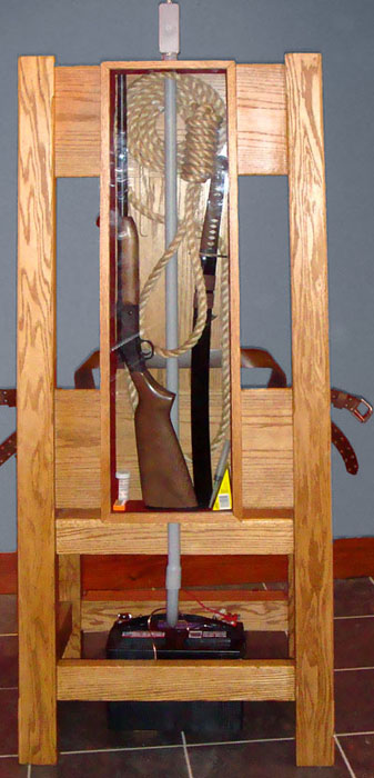
In 2009, Minsky created Freedom of Choice, a work that some would race to classify as installation rather than a fine binding. However, consider the language used by Minsky in his own discussion of the work and re-examine the work's "contents" (which would in this case be exterior to the book itself) from the perspective of a cabinet of curiosities, and the work is unmistakably a bound book. Taken from the artist's website "Copy No. 1, above, is printed inkjet on J. Barcham Green handmade paper with a 1976 watermark, bound in dark teal goatskin with 23K gold title, chained to an oak electric chair. On the inside of the head restraint are three electrodes, and one electrode goes to the leg. An MP3 player on the head restraint plays Minsky's reading of the three poems, two of which concern shotgun suicides and one an electrocution. On the back of the chair is a cabinet containing a 20 gauge shotgun, a Manila hangman's noose, a wakizashi sword, razor blades, poison and a hypodermic syringe."
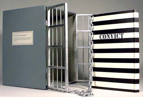
The Bill of Rights is a set of fine bindings Minsky has been working on since 1993. The books, sold and displayed as a unified collection, examine concepts as vast as freedom, war, religion, the future, the criminal justice system, and our political history while utilizing challenging, thought-provoking structures in dialogue with these concepts.
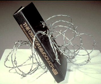
Crisis of Democracy is a transformed paperback bound in sheepskin and held upright in a barbwire stand positioned, according to the artist, in a way that reading the book, "slowly erodes the decorative surface of the skin." Here, not only is the display of the artwork taken into considering as ancilirary to the book, but it is inseparable and integral part of the book's logos.

The Geography of Hunger may well be regarded as much a book sculpture as an artist's book. As the artist himself describes the piece, "The author was Chairman of the Executive Committee of the Food and Agriculture Organization. His conclusion is that the countries of the world are all capable of feeding their starving populations, but don't for political reasons. The binding is moulded and carved plastic, with a world map in acrylic paint-- the mouth of the world. The endpapers are labels from food cans bought at my local bodega, from countries where the people are starving and we get their food, and labels from Mighty Dog Gourmet Dog Food, because in this country there are old people who eat dog food and dogs who eat better than many people in the world."
Monday, January 23, 2012
Earth Inspired Works of Maggie Puckett
A surprising discovery are the books Thaw, Lick, and Soil Horizons, part of the ANTHROPOCENE project by Chicago-based artist Maggie Puckett. While I tend to find artists books about climate change a bit preachy and lacking in science, what is fascinating about these three books is how the process is so closely linked to their readable state, the process forming their content. They are also just beautifully crafted and very inspirational.
THAW

Thaw is a book bound, frozen and currently biodegrading. Last update during the end of Spring last year was "bugs!"
SALTY

Salty is a book that requires you to read with your tongue. The pages are made out of salt. The paper is made out of a combination of paper rag and table + sea salt.
SOIL HORIZONS

If you've ever been to a raw vegan restaurant, chances are you probably have tried raw food. Consider this a "raw book." Soil horizons is made of paper, soil, sand, roots, and leaves. Turning the pages is like digging through layers of earth. The books heft alone is impressive, and about as overwhelming as the idea of digging down to the Earth's core.
THAW
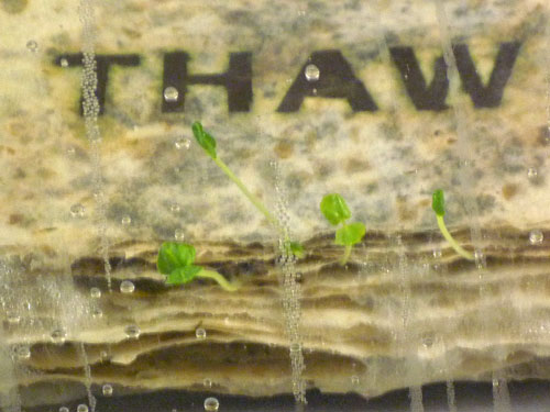
Thaw is a book bound, frozen and currently biodegrading. Last update during the end of Spring last year was "bugs!"
SALTY
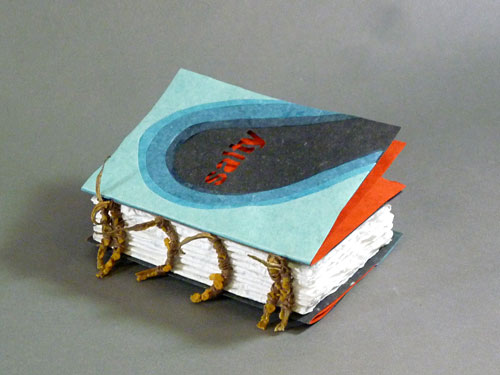
Salty is a book that requires you to read with your tongue. The pages are made out of salt. The paper is made out of a combination of paper rag and table + sea salt.
SOIL HORIZONS
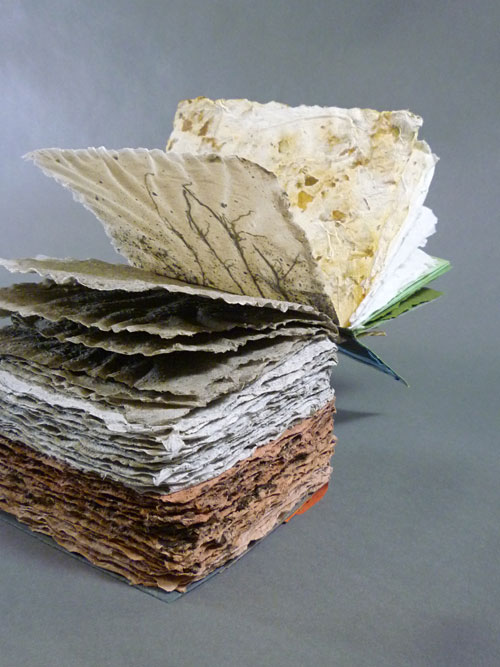
If you've ever been to a raw vegan restaurant, chances are you probably have tried raw food. Consider this a "raw book." Soil horizons is made of paper, soil, sand, roots, and leaves. Turning the pages is like digging through layers of earth. The books heft alone is impressive, and about as overwhelming as the idea of digging down to the Earth's core.
The New & The Old: Possibilities & Aesthetics of Letterpress
In researching for an upcoming project where I'll be attempting to letterpress leather, I happily stumbled upon the work of Amos Paul Kennedy, Jr., a letterpress printer based in Georgia.


The discovery of Kennedy's refreshingly voiced and graphically bold posters couldn't come at a better time. After attending the CBAA conference here at Mills and hearing Cliffton Meador's speech about how letterpress printing has overshadowed other forms of printing, particularly offset lithography, I was beginning to feel certain negative opinions of my own towards the clique of letterpress.
Although I do enjoy the aesthetics of letterpress, and love a good 8 hour print run, I do have share some of the same concerns Meador brought up in his talk. For example, take the fact that Vandercooks are utilized as the primary source of "printing technology" in nearly all college Book Arts programs, a fact Meador attributes to their availability and cost-effectiveness during the 1970s when many Book Arts programs were being formed. This focus on letterpress also at times furthers the somewhat arbitrary distinction between programs that employ various other printing techniques, discouraging collaboration between programs including: graphic design, fine art, digital printing, 3d printing, and print making. I also share Meador's disease with how many "picture books" are overlooked in the realm of artist's books, both by academics as well as curators and collectors.
Meador also touched upon aesthetic issues with letterpress. In recent years, letterpress has gathered a cult following centering around a certain kind of retrophilia that I generally find to be kitschy. This is not to say that all works produced via letterpress are inherently "old-timey" but as previously mentioned there does seem to be some confusion over how to discuss using newer technologies (and it would follow aesthetics) in combination with letterpress. As a result, it's not uncommon to find fairly simplistic graphics via polymer plates or linoleum blocks accompanying text in artist's books, where images produced via alternative modern technologies could possibly result in more dynamic graphics with a more novel aesthetic.
Again, this is certainly not true of all works produced by letterpress and there is a tradition to letterpress that I observe and respect. At the same time, I think as the art form continues to gain momentum it's important to consider new ways to use old technology as well as considering the benefits of newer technology.
In my own work, I incorporate letterpress in ways which are self-referential but experimental, aware of their unique production as well as reminiscent of their historical usage. Instances of this self-referential element occur in the books Nothing In That Drawer where the ink fades from completely saturated to a dry stamp and The Vineyard where the words of Woolf and Steel are intentionally letterpress printed to speak of the history of the production of texts (the words of Steel traditionally letterpress printed now produced in trade copies where the text is cheaply and digitally imprinted (highlighting the aura of the rare book vs. the fleeting satisfaction of the modern novel as commodity). Maybe the key word here is intention. Should an artist (of any kind) choose to use letterpress, I believe it should be for a reason and that that reason should go beyond the commercial appeal or the availability of the Vandercook.

The discovery of Kennedy's refreshingly voiced and graphically bold posters couldn't come at a better time. After attending the CBAA conference here at Mills and hearing Cliffton Meador's speech about how letterpress printing has overshadowed other forms of printing, particularly offset lithography, I was beginning to feel certain negative opinions of my own towards the clique of letterpress.
Although I do enjoy the aesthetics of letterpress, and love a good 8 hour print run, I do have share some of the same concerns Meador brought up in his talk. For example, take the fact that Vandercooks are utilized as the primary source of "printing technology" in nearly all college Book Arts programs, a fact Meador attributes to their availability and cost-effectiveness during the 1970s when many Book Arts programs were being formed. This focus on letterpress also at times furthers the somewhat arbitrary distinction between programs that employ various other printing techniques, discouraging collaboration between programs including: graphic design, fine art, digital printing, 3d printing, and print making. I also share Meador's disease with how many "picture books" are overlooked in the realm of artist's books, both by academics as well as curators and collectors.
Meador also touched upon aesthetic issues with letterpress. In recent years, letterpress has gathered a cult following centering around a certain kind of retrophilia that I generally find to be kitschy. This is not to say that all works produced via letterpress are inherently "old-timey" but as previously mentioned there does seem to be some confusion over how to discuss using newer technologies (and it would follow aesthetics) in combination with letterpress. As a result, it's not uncommon to find fairly simplistic graphics via polymer plates or linoleum blocks accompanying text in artist's books, where images produced via alternative modern technologies could possibly result in more dynamic graphics with a more novel aesthetic.
Again, this is certainly not true of all works produced by letterpress and there is a tradition to letterpress that I observe and respect. At the same time, I think as the art form continues to gain momentum it's important to consider new ways to use old technology as well as considering the benefits of newer technology.
In my own work, I incorporate letterpress in ways which are self-referential but experimental, aware of their unique production as well as reminiscent of their historical usage. Instances of this self-referential element occur in the books Nothing In That Drawer where the ink fades from completely saturated to a dry stamp and The Vineyard where the words of Woolf and Steel are intentionally letterpress printed to speak of the history of the production of texts (the words of Steel traditionally letterpress printed now produced in trade copies where the text is cheaply and digitally imprinted (highlighting the aura of the rare book vs. the fleeting satisfaction of the modern novel as commodity). Maybe the key word here is intention. Should an artist (of any kind) choose to use letterpress, I believe it should be for a reason and that that reason should go beyond the commercial appeal or the availability of the Vandercook.
Friday, November 18, 2011
Time, Sequence and Technology: Conference SF January 5 - 7 2012
Great news west coast book artists! The College Book Arts Association has decided to host its upcoming 2012 conference in our own backyard. This is actually great news for all of us, as it's a conference worth traveling to. Here you'll meet book artists from across the nation as well as international visiting artists. A series of brief lightning talks on this year's topic of "Time, Sequence and Technology" will see both talented students (such as yours truly) and celebrated book artihttp://www.blogger.com/img/blank.gifsts share their thoughts and inspirations. Round table discussions, divided into three groups: graduates, curators, and educators, will invite viewers to share their book-arts related questions with participants. The first day of these discussions will be hosted on Mills College campus in Oakland, CA; the second day, at The Hilton in Emeryville. Also: key note speaker Buzz Spector will allow you the opportunity to meet and get to http://www.blogger.com/img/blank.gifsee live and in the flesh Buzz Spector! For those hands-on types looking to learn something new, a series of demonstrations from Secret Belgian Binding to Cyanotype Printing will also be held in coordination with the conference. Should you want to take some new work home for yourself, the CBAA will host its first ever live auction. Lastly, but not least(ly?), a juried exhibition of members' work will be held January 5 - March 11th on the sixth floor of the San Francisco Public Library. Save the date and register here: http://www.collegebookart.org/cbaa_meetings_conferences!

Broadsides Contemporary Writers Series Mills College
The university I currently call my home away from home, Mills College, offers as part of its Book Arts program the opportunity for students to work with visiting writers on the production of a broadside (or one-sided letterpressed poster). The letterpress portion of the program under the tutelage of Kathleen Walkup also offers students the ability to work on a variety of press models to produce broadsides and limited edition print projects. They are quite lovely. Some examples below:


More here: http://www.mills.edu/academics/graduate/eng/the_scene/broadside_series.php
More here: http://www.mills.edu/academics/graduate/eng/the_scene/broadside_series.php

Monday, October 3, 2011
PRESS - San Francisco Book Art Store
Dear SF Local Book Artist,
I've been meaning to write to you about PRESS, the most adorable book art store ever to set foot on the streets of San Francisco.

PRESS, located in the Mission just shy of Dolores Park, carries a variety of book binding tools including folders, a small selection of Japanese papers, thread, and various other neat things that could be used for even neater purposes (vintage piano scrolls, anyone?) They also carry a variety of small press books, facsimiles, and vintage hard-to-find paperbacks (I picked up a Bucki Fulli that no one seems to have heard of!)

They also offer WORKSHOPS in binding, box making, and a number of other applicable, useful-to-know things for extraordinarily low costs. Their upcoming herringbone binding workshop is only $75! Not only that! Included in the class fee is a kit which has everything you'll need to get started: needles, thread, a bookbinding awl, vintage pencil and bone folder. Okay okay, so you need to bring your own ruler & scissors. Like you don't already carry that everywhere with you anyway.
I had the pleasure of meeting one of the store owners, Nick Sarno, who I can vouch is a dedicated book lover and a really nice guy. Go in! Say hi!
I've been meaning to write to you about PRESS, the most adorable book art store ever to set foot on the streets of San Francisco.
PRESS, located in the Mission just shy of Dolores Park, carries a variety of book binding tools including folders, a small selection of Japanese papers, thread, and various other neat things that could be used for even neater purposes (vintage piano scrolls, anyone?) They also carry a variety of small press books, facsimiles, and vintage hard-to-find paperbacks (I picked up a Bucki Fulli that no one seems to have heard of!)
They also offer WORKSHOPS in binding, box making, and a number of other applicable, useful-to-know things for extraordinarily low costs. Their upcoming herringbone binding workshop is only $75! Not only that! Included in the class fee is a kit which has everything you'll need to get started: needles, thread, a bookbinding awl, vintage pencil and bone folder. Okay okay, so you need to bring your own ruler & scissors. Like you don't already carry that everywhere with you anyway.
I had the pleasure of meeting one of the store owners, Nick Sarno, who I can vouch is a dedicated book lover and a really nice guy. Go in! Say hi!
Monday, July 25, 2011
Small Press List from Codex 2011

I've scoured the internet for a list of small presses that produce artist books, and the best that I could find would be the list of exhibitors from the Codex Foundation's 2011 Book Fair. The Codex Foundation holds a not-to-be-missed book fair every two years featuring some of the most talented book artists around the globe. In many cases, you get to meet the artists themselves, talk shop about their press, or buy their most recent book (should you be lucky enough to afford it!) I'll write lots more on the role of small presses later, but for now here are some presses to explore.
LIST OF SMALL PRESSES FROM THE CODEX BOOK FAIR 2011

Zweite Enzyklopädie von Tlön by Peter Malutzki and Ines von Ketelhodt
Some of my favorite small presses of the moment include Women's Studio Workshop, Granary Books, Nexus Press (now extinct but you can still find many of their multiples in circulation), Aviary Press, Scantron Press, Coracle Press, Visual Studies Workshop and M.K. Publishers. Oh and THESE PEOPLE are amazing!
Tutorial Time V.1
For those eager to get started on some simple book forms, there are a number of handy recipes available on INSTRUCTABLES (one of my favorite making things sites). Here are a few I found, but there's lots more!

MAKE YOUR OWN BOOK PRESS: Presses are useful, if not essential for keeping the book / pages flat while the glue dries. PVA can cause pages and even board to warp. Unfortunately, presses are pretty expensive and while flat weights (such as other books!) can work, budding professionals might want to try this industrial DIY alternative made from wood and brass.

SOFT COVER PAMPHLET: A bit different than how I would do it (I would probably just use a wrap-around cover) but effective and simple.

ENVELOPE BOOK: For a crafty project, this is quite complicated and uses a lot of formal techniques. The sewing could be simplified, definitely and you might want to include some pages or other content instead of envelopes.

HARDBOUND BOOK: Try sewing the signatures instead of stapling them for a more authentic and sturdier product. That said, the formula for creating the cover is pretty much spot on.

MAKE YOUR OWN BOOK PRESS: Presses are useful, if not essential for keeping the book / pages flat while the glue dries. PVA can cause pages and even board to warp. Unfortunately, presses are pretty expensive and while flat weights (such as other books!) can work, budding professionals might want to try this industrial DIY alternative made from wood and brass.

SOFT COVER PAMPHLET: A bit different than how I would do it (I would probably just use a wrap-around cover) but effective and simple.

ENVELOPE BOOK: For a crafty project, this is quite complicated and uses a lot of formal techniques. The sewing could be simplified, definitely and you might want to include some pages or other content instead of envelopes.

HARDBOUND BOOK: Try sewing the signatures instead of stapling them for a more authentic and sturdier product. That said, the formula for creating the cover is pretty much spot on.
Monday, May 3, 2010
What Is Book Art?
While the Wiki certainly has a lot to say on the subject, there remains some uncertainty over just what the term "book art" can or should be used to refer to. Is a book artist an artist who makes books? Or an artist who uses books as a medium to make art? Maybe both or something in between? At what point does a book stop being a book and become an art object? What (exactly) IS book art anyway? Even if an exact definition or set of criterion is near to impossible to muster, there are a few identifiable themes in the field of Book Art that we’ll probe in this blog. Below is a brief introduction to a few of these themes.

Book Art By Liz Hamman
Binding, Bookmaking and Book Forms: One of the most intriguing and tell-tale signs of a work of book art is an interrogation of the book's form, structure, and content, including the investigation of historic and new forms of books. This investigation can begin or end at any point in the bookmaking process: selection of materials, paper structures (including accordions and other folded structures), printing (letterpress, hand press, inking, painting, lithography, and so on.), or binding.

[Reconstructed Book by UK textile artistJackie Bowcutt]
Sculptural Books: Sculptural books are works of art that begin or end with the book form. In the former, books are often manipulated by dis-assembly and re-assembly to create new structures. The popular terms "hacked books" or "altered books" can also sometimes be used to describe the resulting structures, although these terms are generally applied to more crafted objects. For the latter, various materials are reinterpreted to form book-like structures.
Construction, Re-Construction and Deconstruction: Many artists explore the medium of the book through a process of construction, deconstruction, or re-construction. Construction concerns the basic elements of the book: spine, cover, signatures (groups of bound pages). Deconstruction explores the disassembling of the book form either at the physical or figurative level. Re-construction explores not only the disassembling of the book into its basic elements but also the creation of the book, at times using alternative or re-used materials. Materials as diverse as cloth, steel, and plastic have been adapted into the book form as well as objects such as jars, boxes (including wunderkammer pieces), and other forms exploring the book as "container" or catalog. Re-construction can also involve taking apart or modifying existing books as well as other printed materials (magazines, comics, etc.) to create new forms (see book-like objects).
Self-Reflexivity: Some works of book art, particularly artist's books, demonstrate in either their material make up, contents, or both an awareness of their own "bookish" qualities. This self-referential acknowledgment may call to mind questions about the role of artist's books (or books and art independently) in society.
Editions and Multiples: Works of Book Art can appear as limited edition, one of a kind pieces, or multiples (intended for mass production & distribution). The level of production of the book may indicate the book's intended distribution, target, or agenda.

[Stainless steel object "The Book" by Czech artist JAROSLAV VÁLEK]
Book-like Objects: A sub-category of sculptural books. These works typically resemble or manipulate facets of the book but are not necessarily considered in and of themselves books (i.e. meant to be "read"). Works of this sort typically challenge the role of books as inherently useful objects, in contrast to fine art's famed in-utility.
Fine Press & Fine Binding: Fine press refers to materials printed in a highly decorative manner, such as with letterpress or elements of the hand such as illuminated lettering, glorifying the text. These works often follow in the tradition of William Morris. Fine press works are not necessarily considered "artist's books" as they do not necessarily interrogate the structure of the book in a critical manner. Similarly, fine binding is decorative or luxurious binding that glorifies or re-interprets the contents of the book. Fine binding alone does not, for the same reason, necessarily qualify a book as an artist's book.
Zines: Zines are normally low-budget, homemade or small press magazines which may include either text and / or images as well as other content (there are zines, for example, that take an audio format). No one seems to agree where zines fit in the world of Book Art, or if they even fit in at all. Many book artists tend to cringe at the word “zine" and with some justification. Zines do not necessarily challenge the book form. To aggravate the problem further, to many who are unfamiliar with the field of book arts, self-publication or zine making appear to be in equivocal standing with book art. One could see how the trained book artist might take offense to this. At the same time, many well respected limited edition publications started as zines and many democratic multiples could still be considered “zines.”

[A selection of zines. Photo from We Make Zines]
Of course this is just a very brief overview of some concepts central to book art, a field as diverse as book artists are themselves. In lieu of creating an exact definition for the term, which may in the end prove as difficult as defining art itself, this blog hopes to create a comprehensive overview, acting as a survey of the history of book art up to the present, a platform to debate current topics and trends in the field of book art, an introduction to currently active book artists worldwide, and a digital platform for the highly physical world of book art.

Book Art By Liz Hamman
Binding, Bookmaking and Book Forms: One of the most intriguing and tell-tale signs of a work of book art is an interrogation of the book's form, structure, and content, including the investigation of historic and new forms of books. This investigation can begin or end at any point in the bookmaking process: selection of materials, paper structures (including accordions and other folded structures), printing (letterpress, hand press, inking, painting, lithography, and so on.), or binding.
[Reconstructed Book by UK textile artistJackie Bowcutt]
Sculptural Books: Sculptural books are works of art that begin or end with the book form. In the former, books are often manipulated by dis-assembly and re-assembly to create new structures. The popular terms "hacked books" or "altered books" can also sometimes be used to describe the resulting structures, although these terms are generally applied to more crafted objects. For the latter, various materials are reinterpreted to form book-like structures.
Construction, Re-Construction and Deconstruction: Many artists explore the medium of the book through a process of construction, deconstruction, or re-construction. Construction concerns the basic elements of the book: spine, cover, signatures (groups of bound pages). Deconstruction explores the disassembling of the book form either at the physical or figurative level. Re-construction explores not only the disassembling of the book into its basic elements but also the creation of the book, at times using alternative or re-used materials. Materials as diverse as cloth, steel, and plastic have been adapted into the book form as well as objects such as jars, boxes (including wunderkammer pieces), and other forms exploring the book as "container" or catalog. Re-construction can also involve taking apart or modifying existing books as well as other printed materials (magazines, comics, etc.) to create new forms (see book-like objects).
Self-Reflexivity: Some works of book art, particularly artist's books, demonstrate in either their material make up, contents, or both an awareness of their own "bookish" qualities. This self-referential acknowledgment may call to mind questions about the role of artist's books (or books and art independently) in society.
Editions and Multiples: Works of Book Art can appear as limited edition, one of a kind pieces, or multiples (intended for mass production & distribution). The level of production of the book may indicate the book's intended distribution, target, or agenda.
[Stainless steel object "The Book" by Czech artist JAROSLAV VÁLEK]
Book-like Objects: A sub-category of sculptural books. These works typically resemble or manipulate facets of the book but are not necessarily considered in and of themselves books (i.e. meant to be "read"). Works of this sort typically challenge the role of books as inherently useful objects, in contrast to fine art's famed in-utility.
Fine Press & Fine Binding: Fine press refers to materials printed in a highly decorative manner, such as with letterpress or elements of the hand such as illuminated lettering, glorifying the text. These works often follow in the tradition of William Morris. Fine press works are not necessarily considered "artist's books" as they do not necessarily interrogate the structure of the book in a critical manner. Similarly, fine binding is decorative or luxurious binding that glorifies or re-interprets the contents of the book. Fine binding alone does not, for the same reason, necessarily qualify a book as an artist's book.
Zines: Zines are normally low-budget, homemade or small press magazines which may include either text and / or images as well as other content (there are zines, for example, that take an audio format). No one seems to agree where zines fit in the world of Book Art, or if they even fit in at all. Many book artists tend to cringe at the word “zine" and with some justification. Zines do not necessarily challenge the book form. To aggravate the problem further, to many who are unfamiliar with the field of book arts, self-publication or zine making appear to be in equivocal standing with book art. One could see how the trained book artist might take offense to this. At the same time, many well respected limited edition publications started as zines and many democratic multiples could still be considered “zines.”
[A selection of zines. Photo from We Make Zines]
Of course this is just a very brief overview of some concepts central to book art, a field as diverse as book artists are themselves. In lieu of creating an exact definition for the term, which may in the end prove as difficult as defining art itself, this blog hopes to create a comprehensive overview, acting as a survey of the history of book art up to the present, a platform to debate current topics and trends in the field of book art, an introduction to currently active book artists worldwide, and a digital platform for the highly physical world of book art.
Subscribe to:
Posts (Atom)